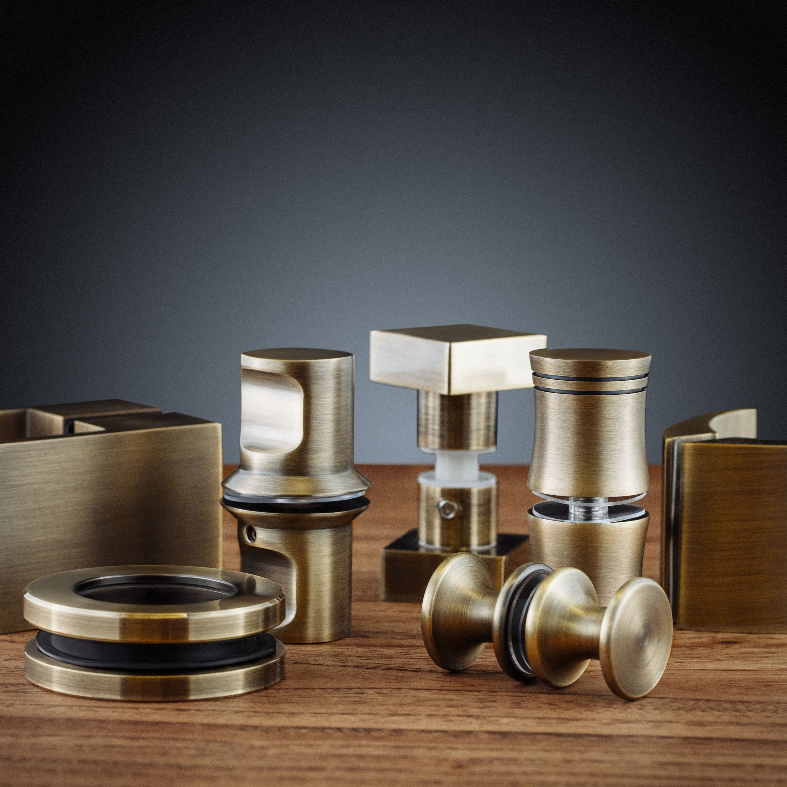
In an online store, a photograph isn’t decoration — it’s the replacement for a sales assistant. A buyer can’t pick the item up, turn it over, check the seam or smell it. All they have is your images and your copy. If the images don’t answer their questions, they don’t buy: they go to a competitor whose images do.
And stores usually have one problem and one overcorrection. The problem: cards shot on a phone by a window, grey background, wrong colour. The overcorrection: a beautiful shoot is commissioned, the product looks like a magazine page — and returns climb, because in real life it’s different.
Below: what your store’s content actually needs, how a product card differs from lifestyle, and where the line falls between “beautiful” and “true”.
An honest caveat
Photographs won’t sell a bad product. They influence the click and the decision, but if the product doesn’t match the price and delivery takes three weeks, no shoot fixes that. Photography works over a short stretch: the person has already seen you in the results, and they have thirty seconds to work out whether the item is right for them.
And a second, less obvious part. In an online store, good photography isn’t only about conversion — it’s about reducing returns. When images show the real colour, the real scale and the real texture, the person gets what they expected. When they don’t, you pay for it: in reverse logistics and in reputation.

Three types of content, and what each is for
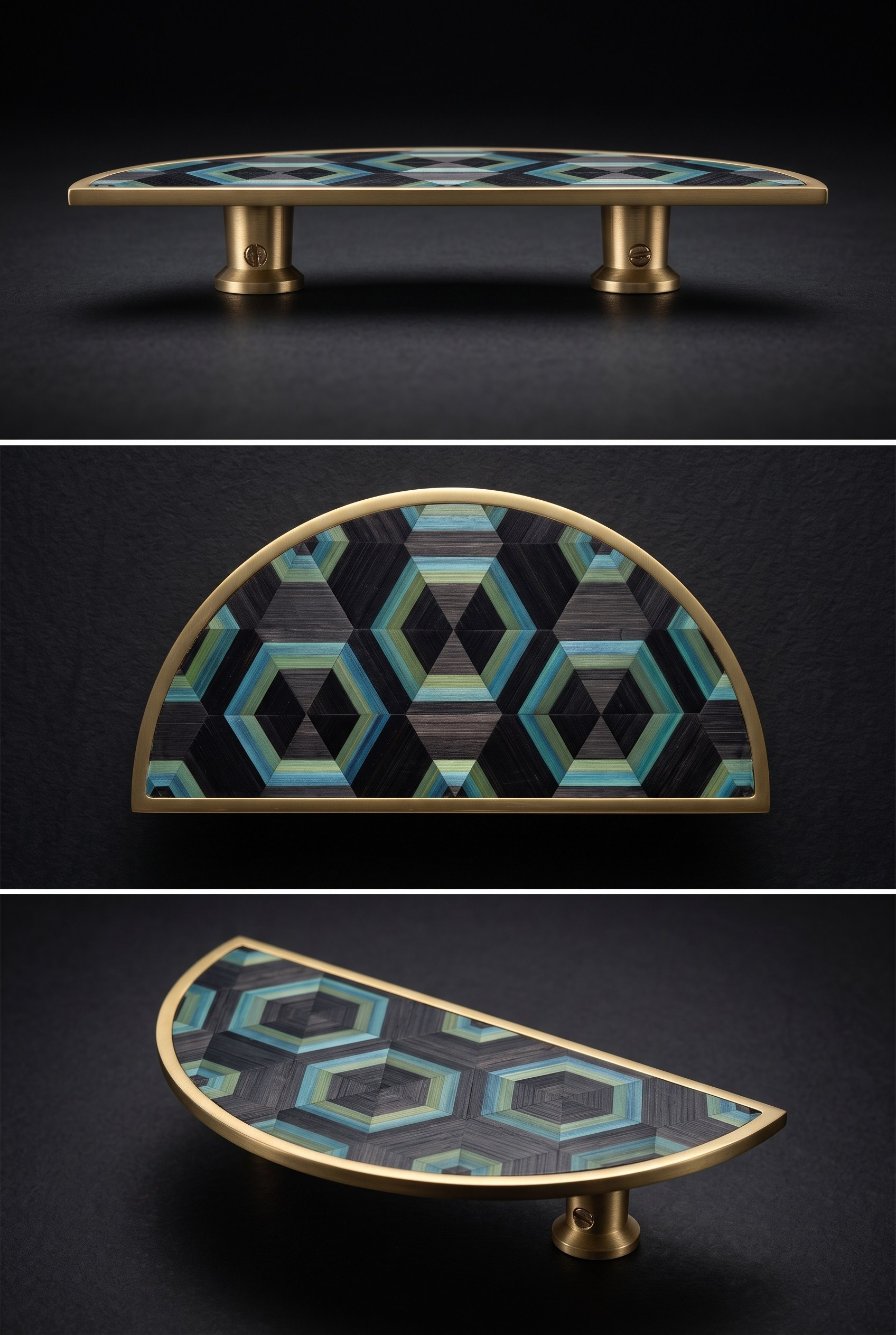
The product card. Functional photography: the item on a neutral background, every angle, the details, the scale. Its job is to answer questions and remove objections. It doesn’t need to be “beautiful” — it needs to be “accurate”.
Lifestyle. The product in the environment where it’s used: on a person, on a table, in a room. The job is to show how the item fits into the buyer’s life and who it’s for.
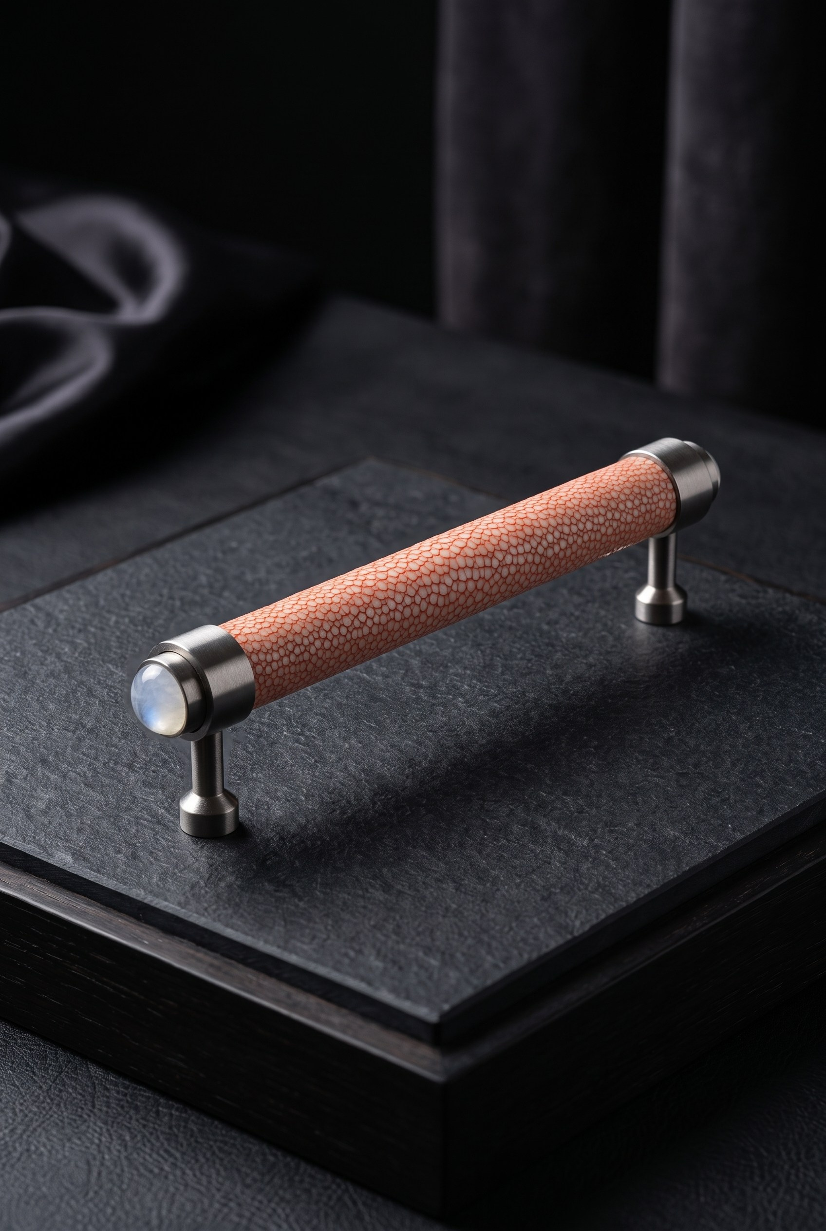
Proof of quality. Macro: the seam, the texture, the cut, the weave, the fastening, the composition on the label. The job is to convey quality on a screen. This is the most underrated group — it’s the one that settles the doubt “is this cheap tat”.
You need all three together. A card without lifestyle answers “what is this” but not “will it suit me”. Lifestyle without a card is handsome but useless: the buyer can’t tell what will arrive in the parcel.
| Shot type | What question it settles | Where to use it | How to shoot it |
|---|---|---|---|
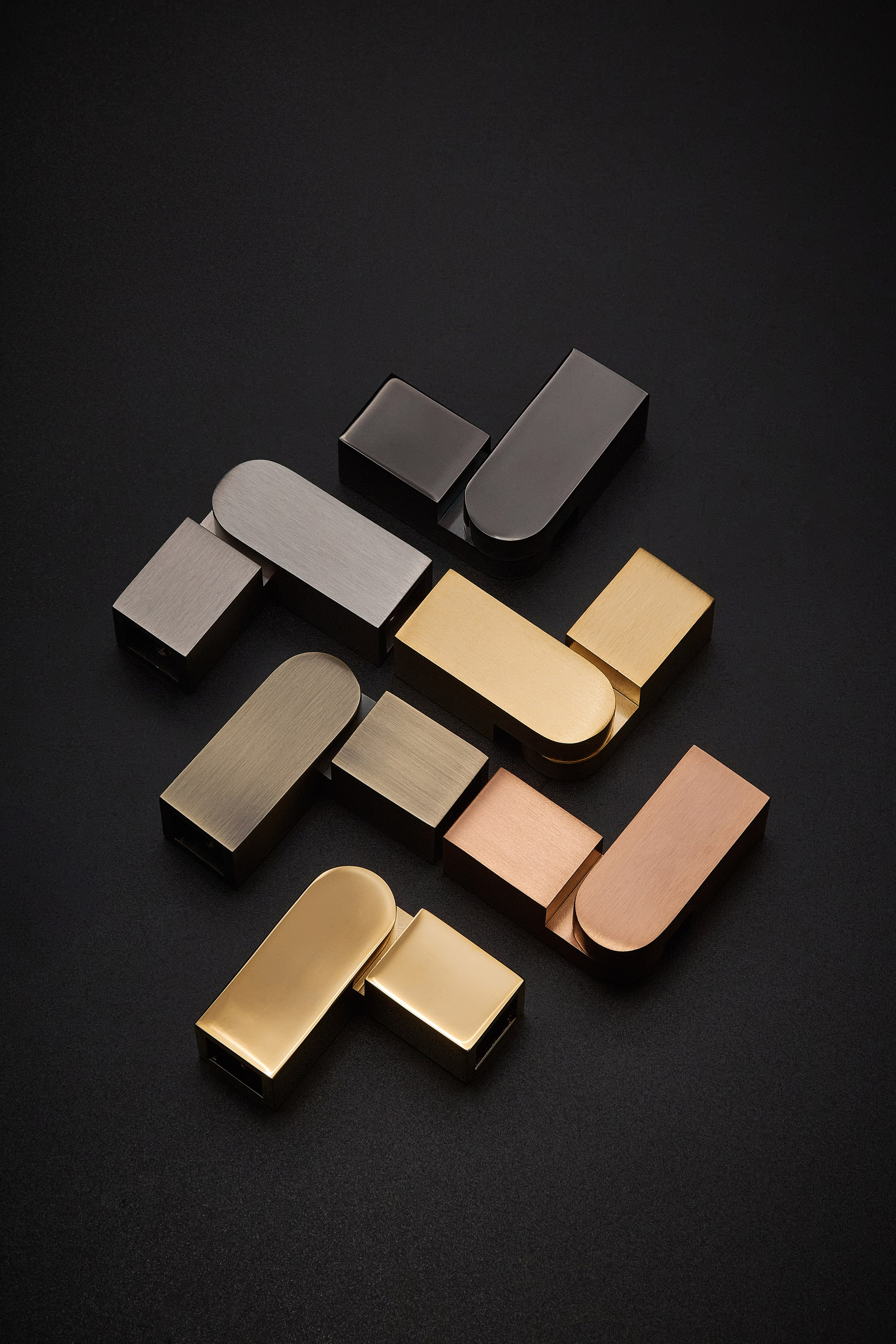
| Product on a neutral background | what exactly will arrive in the parcel | catalogue, product page, marketplace | even light, white or light grey background, no harsh shadows |
| Angles | how it looks from every side | product gallery | front, side, back, top, inside |
| Scale | how big the item actually is | product page, social media | next to an object of known size, or held in a hand |
| Macro and texture | whether it’s cheaply made | product page, advertising | seam, texture, fastening, cut edge, the label |
| Lifestyle | will it suit me, who is it for | product page, social media, advertising | in use, with a model of a comparable type |
| Packaging and contents | what arrives and in what state | product page, delivery page | the box, the insert, everything inside |
Channel requirements: where stores most often fail
The same product lives under different rules in different channels. Stores often shoot one set “for everything” — and then half the frames fail moderation or crop badly.
Marketplaces almost always require a white background on the main image, a minimum resolution, and forbid collages, text and extraneous objects in the first frame. Requirements change, so check the current ones in the platform’s seller dashboard rather than in blog posts.
Your own product page is freer: coloured backgrounds and composition are fine, but the same rule applies — the main image has to answer “what is this” unambiguously.
Advertising needs space for text: if the product fills the frame, the button and the headline land on top of it.
Social media means vertical, because the primary channel is mobile.
| Channel | Ratio | Background and composition | Restrictions |
|---|---|---|---|
| Store catalogue | 1:1 or 4:5 | one background for the whole category | mixed backgrounds across one listing page |
| Product page | 1:1 and vertical | a main image plus 5–8 supporting frames | the same angle repeated under different names |
| Marketplace | per platform spec | usually a white background on the first image | text, collages, extraneous objects |
| Advertising and paid social | 16:9, 4:5, 1:1 | space for a headline and a button | the product cropped at the edges |
| Social media | 4:5 and 9:16 | lifestyle and process, not just the card | publishing catalogue frames only |
| Email campaigns | wide horizontal | a large product, legible on a phone | small details that vanish in a thumbnail |
Lifestyle: where the line with deception falls
Lifestyle sells better than a product card because it shows the item in life. And that’s exactly where stores step over the line.
Problem one — scale. On a lifestyle frame a bag on a model’s shoulder can look large, and a small one arrives. This is the most common reason for returns in clothing and accessories. The fix: the gallery always includes a frame showing scale — the item in a hand, or next to something of known size.
Problem two — colour. Warm evening light makes a beige coat look better than it is. The buyer receives the item and sees a different shade. The fix: one frame under neutral light that the colour can be checked against.
Problem three — the model. Everything fits perfectly on a model because it was chosen for the model. The buyer has a different build, and gets a different result. The fix: show the item on two or three types, not one.
The rule worth remembering: lifestyle can be beautiful, but it must not create expectations the product won’t meet. A handsome lie costs more than an honest plainness — in returns.

How many frames, how often
A store differs from a business shoot in that content here is consumed: every new SKU needs a new set. So what matters isn’t a one-off shoot but a pipeline.
| What | How many frames | How often | Why |
|---|---|---|---|
| A new SKU | 6–10 | with every new arrival | the minimum for a card that doesn’t look empty |
| A whole category | 6–10 per item | once a season | one background across the listing and a predictable catalogue |
| A lifestyle session | 20–40 | 2–4 times a year | frames for social media and ads, not only for cards |
| Best sellers | 12–20 | once a year | priority products deserve the better shoot |
| Seasonal campaign | 10–20 | for each launch | ad creative tires faster than product cards |
| Reshoots | as needed | when the product or packaging changes | outdated frames are worse than no frames |
The practical conclusion: shooting in batches pays. One day covering twenty SKUs costs less than twenty separate visits, and it gives the catalogue a consistent background. A lifestyle session is better done separately and less often — its job isn’t product cards but social media and advertising.
Mistakes I see most often
Grey background and yellow light. The most widespread. An item shot that way looks cheaper than it is, and the colour doesn’t match reality.
Different backgrounds within one category. A catalogue where ten products sit on ten different backgrounds reads as a flea market, however good the goods are.
One angle for everything. Buyers need the back, the inside, the underside — especially in clothing, footwear and furniture.
No sense of scale. The main cause of returns in accessories and home décor.
A handsome lie. A shoot in which the product looks better than it is. It saves on the click and loses on the return.
Nothing but catalogue frames on social media. A feed of white squares doesn’t hold anyone: people need context and life.

FAQ
Can I shoot products on a phone?
For small batches and social media, sometimes yes, if you have even light and a decent background. For a catalogue, no: the difference isn’t sharpness, it’s colour and shadow. A phone indoors almost always adds a yellow cast, and a product card has to show the true colour.
How many angles does a product page need?
At least six: main, side, back, detail, scale, contents. For clothing, add one on a person. Fewer than five frames in a gallery almost always means the buyer leaves with a question unanswered.
Is a white background mandatory?
For marketplaces, as a rule yes — it’s a moderation requirement. For your own site it isn’t, but consistency within the category matters more than the colour itself.
How important is lifestyle if the product is simple?
If the product is self-explanatory — a cable, a battery — lifestyle matters less. If aesthetics matter or there’s a choice to make (clothing, décor, cosmetics), the card loses without it.
What if the product range changes constantly?
Shoot to a template: one lighting setup, one background, one place. Then a new SKU takes fifteen minutes and the catalogue stays consistent.
How do I know the photography is working?
Watch three things: conversion on the product page, the share of returns citing “not as described”, and how far people scroll through the gallery. If they scroll to the end, they have questions — and the frames are answering them. More on shooting for the site and its channels in photography for a company website.
The bottom line
A store needs three things at once: an accurate product card, an honest lifestyle shot, and macro that proves quality. The card answers “what is this”, lifestyle answers “will it suit me”, macro answers “is it cheaply made”.
And one rule that saves more money than any optimisation of the shoot: the photographs must match what the person will receive. Beautiful frames bring the sale; honest ones keep the customer.
If you’d like to put a shoot together for your catalogue, tell me how many SKUs there are and what the product is, and I’ll suggest a format and how many days it will realistically take.