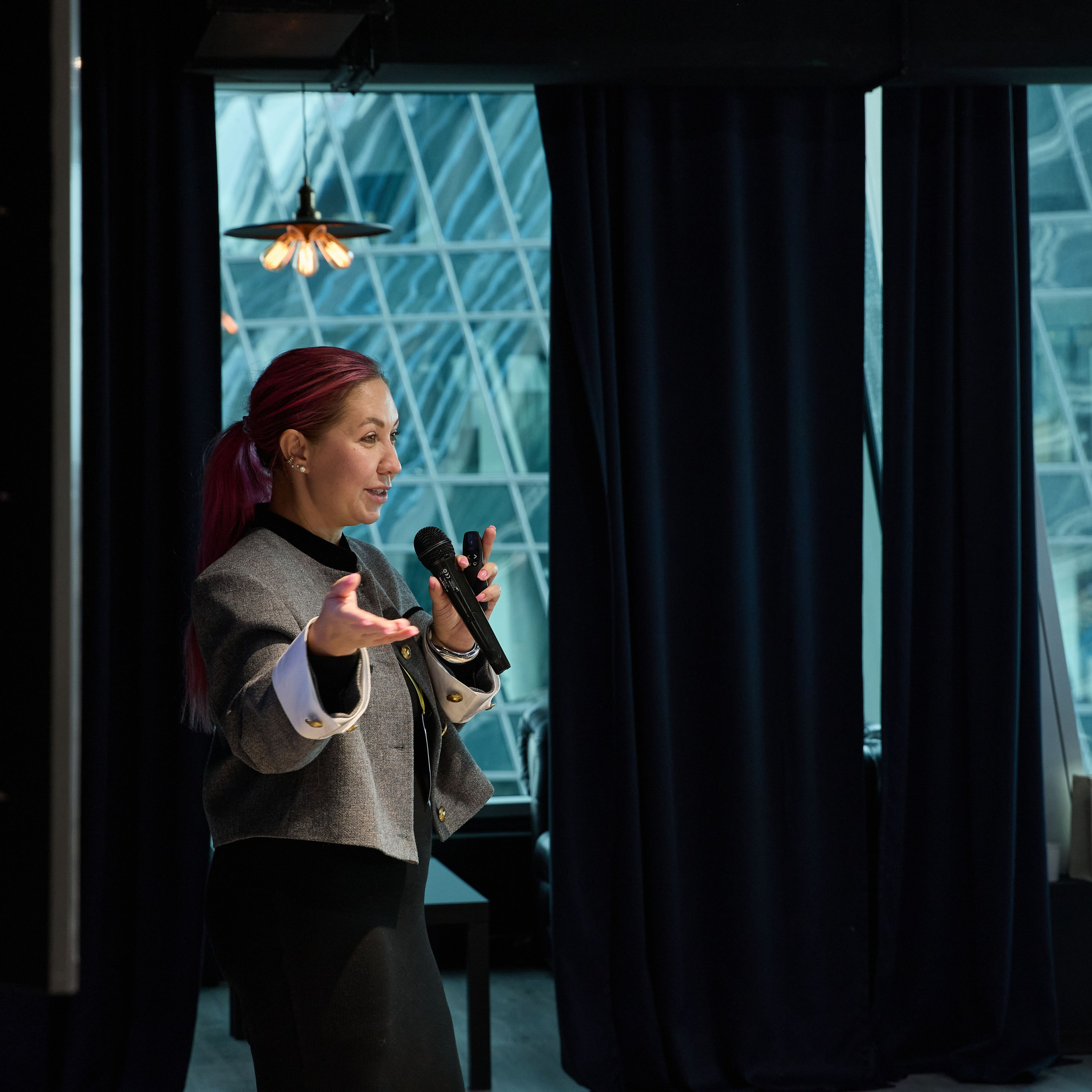
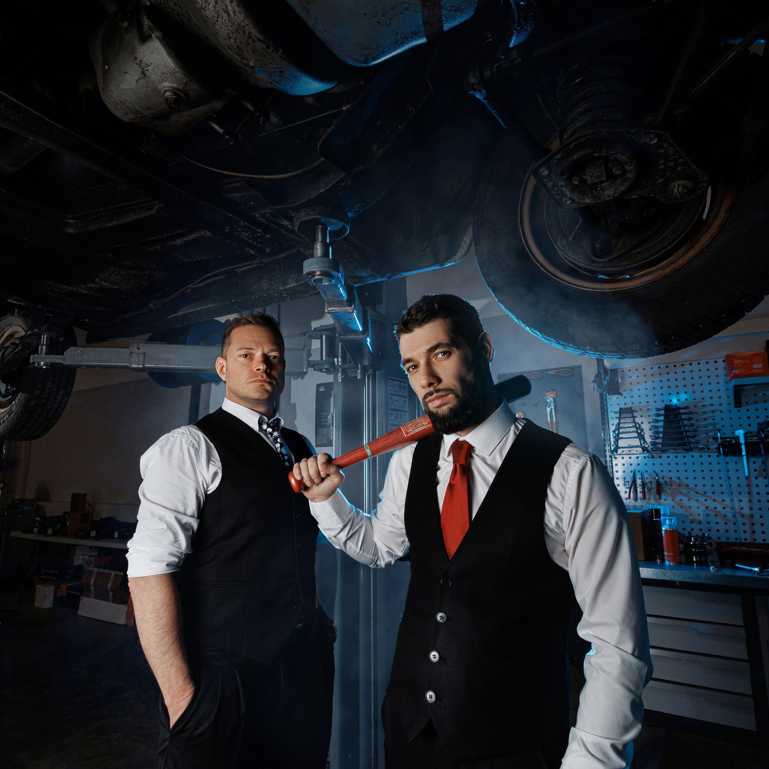
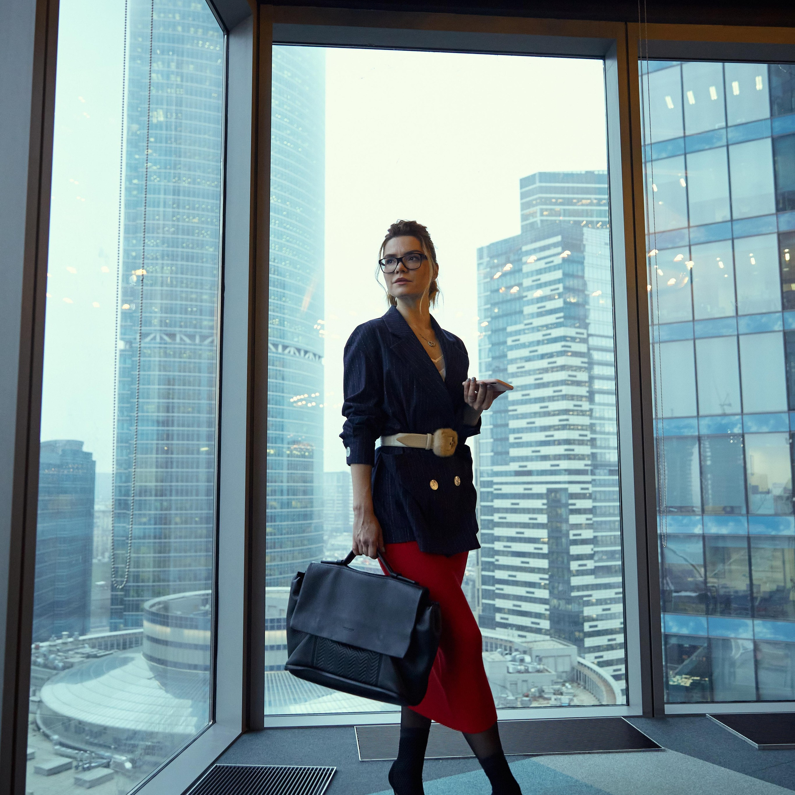
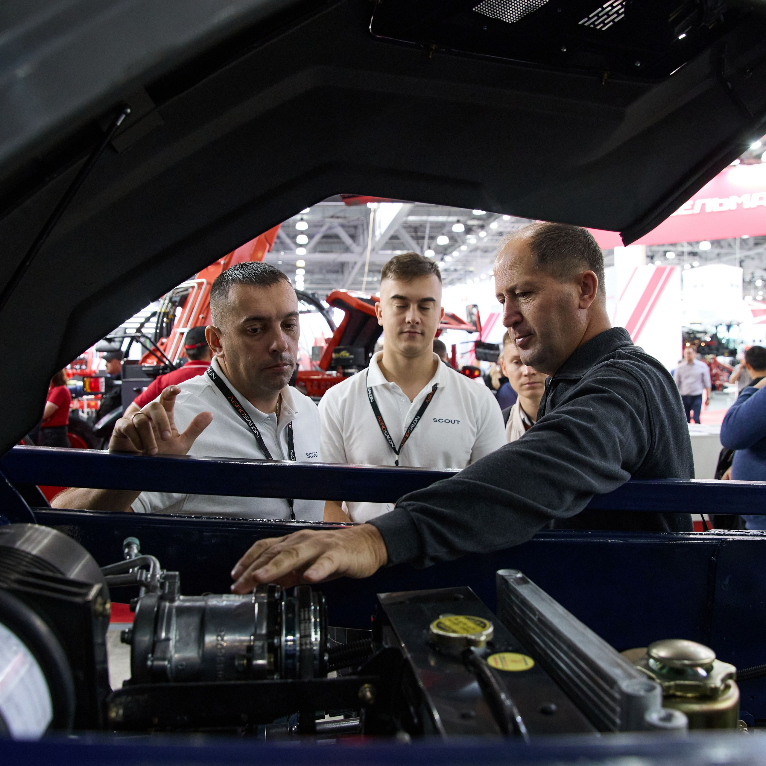
A company commissions a shoot once and then uses it for years — usually badly. The fresh set sits in a folder, the third frame from it ends up on the home page, a five-year-old avatar lingers on social media, and the presentation carries a stock photo. Each file is fine on its own. Together they give the impression that the brand was assembled from whatever was to hand.
Positioning isn’t a tagline. It’s the sum of signals a person receives before they start reading. Photography weighs more heavily in that sum than anything else: it’s processed faster than text and remembered better. The same line — “we’re a reliable partner for large clients” — is reinforced by a photograph of someone in their own office and undone by a photograph of the same person against a graffiti wall.
Below: how to turn photography from a one-off cost into a working asset — the roles it plays, how to cut one set into a dozen formats, and what to refresh, and how often.
A photograph proves; copy asserts
The copy says “we have a strong team”. The photograph shows who those people are. The second is more convincing because it can be checked: the client sees faces, posture, clothing, surroundings and draws a conclusion about the company before finishing the paragraph.
Three consequences follow, and they’re rarely stated outright.
A photograph can’t be neutral. Every frame says something — even the absence of a choice says something. A stock photo of a smiling man in a suit says “we had nothing to show”.
A photograph is checked for consistency. The reader doesn’t analyse, but they notice: if the site says “trading since 2004” and every portrait is shot in a trendy loft with neon, doubt creeps in — and it spreads to the copy, not the photo.
Positioning builds through repetition. One good frame is an accident. A series of thirty frames shot the same way, recurring across channels, is a style.
Three roles photography plays online
To prove. To show what can’t be described: the scale of production, the standard of the office, the makeup of the team, the product itself. This role answers the objection “do you even exist”.
To set the tone. To establish who the company is talking to: formally, at a distance, or casually, as a neighbour. Tone is set not by colour grading but by the distance to the subject, their posture and their surroundings.
To make you recognisable. A consistent approach to shooting — light, angle, background, processing — lets a company be identified from a single frame without a logo. It’s the most underrated of the three, because its effect isn’t visible in one photograph, only across a series.
The mistake is trying to cover all three roles with one frame. A formal portrait proves status but doesn’t show the team; reportage from the factory floor shows process but doesn’t set a premium tone.
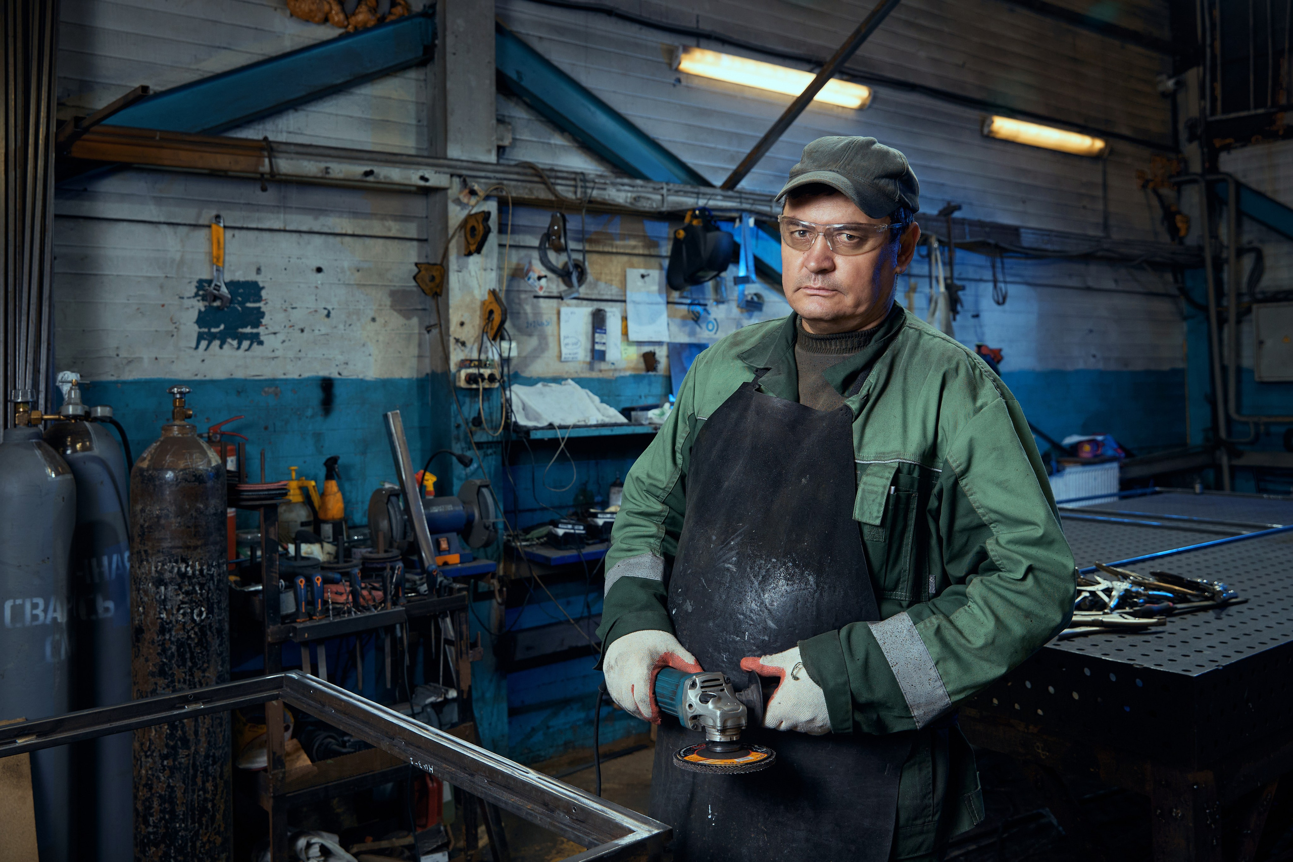
The role of photography by channel
The same person does different jobs in different channels. Below: what the photograph should be doing in each place, and where it most often fails.
| Channel | What the photograph should do | Frame type | Common mistake |
|---|---|---|---|
| Website home page | explain what you do in two seconds | horizontal with space for the headline | an abstract office with no people in it |
| Team page | prove there are real people behind the brand | a portrait series with consistent lighting | frames from different shoots and different years |
| Services page | show the process, not just the result | reportage frames of the work | stock photos of a businessman shaking hands |
| Social media avatar | be recognisable in a feed at 40 pixels | square, large face, contrast with the background | a landscape or a tiny full-length figure |
| Social media feed | hold a rhythm and show the company's life | vertical 4:5, sets of 3–5 frames | the same formal portrait for years |
| Presentation and proposal | confirm the standard before price is discussed | restrained horizontals, formal context | low-resolution photos stretched across a slide |
| Advertising and paid social | stop the scroll | a wide frame with room for the offer | the face covered by a button or headline |
| Case studies and testimonials | connect a result to a specific person | a portrait of the client in their own environment | a written testimonial with no photograph |
| Careers | show what it's like to work there | real working moments, not staged ones | the same photos used for clients |
One set, a dozen formats
A shoot costs money once; cutting formats costs almost nothing. So the right order is: define every place the frames will appear first, and only then shoot. That way the photographer leaves headroom for crops on the day instead of shooting tight for a single layout.
The practical rule: shoot for the narrowest format, not the widest. If a frame survives a 9:16 vertical, it will survive a square and a horizontal. The reverse doesn’t hold: from a tightly framed horizontal you can’t cut a vertical.
| Format | Ratio | Where to use it | What must not be cropped |
|---|---|---|---|
| Square | 1:1 | avatars, carousels, testimonials | top of the head and chin — leave space above |
| Social vertical | 4:5 | Instagram, Facebook, LinkedIn feeds | hands near the edge — they get cut first |
| Stories and reels | 9:16 | stories, shorts, vertical banners | the bottom 15% — the interface sits there |
| Website hero | 16:9 | home screen, header, video stills | clear space on one side for the headline |
| Print portrait | 2:3 | presentations, brochures, speaker pages | headroom above — without it the frame feels cramped |
| Wide banner | 21:9 | social covers, channel headers | a face in the centre — the edges will cut it |
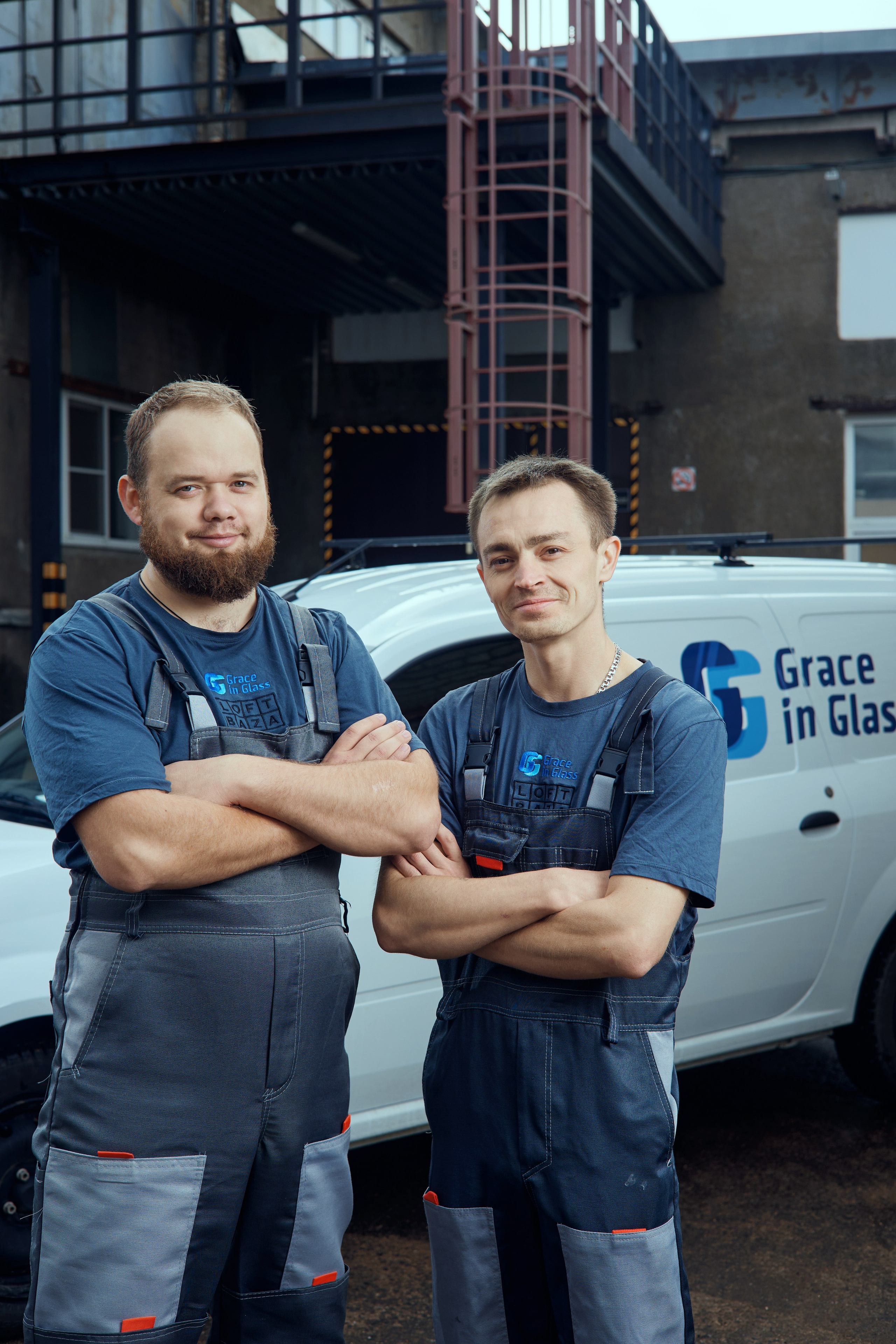

Consistency: where it breaks
A consistent visual style doesn’t require identical photographs. It requires identical decisions: where the light sits, at what height the camera is, what the background is, how dense the processing is.
It usually breaks in four places.
Different years in one series. A 2019 portrait next to a 2025 portrait is visible without any analysis: the processing, the colour and the crop have all moved. If you can’t reshoot everyone at once, update in blocks — but don’t mix them.
Different photographers with no brief. Two people will photograph the same employee differently, and that’s normal. What isn’t normal is giving them different starting points: where we shoot, what the background is, what the light is, where the subject looks.
Inconsistent processing. Warm frames mixed with cool, contrasty with soft. That reads as “assembled from different sources” even where you shot all of it yourself.
Stock among your own frames. The most visible of the errors. A stock frame differs in light and in how staged it looks, and it’s the only one with no real person behind it. If you’re short of material, fewer frames but your own is the better trade.
Refresh rhythm
Photographs age unevenly. Some last a year, some three. Below are the benchmarks to plan by, rather than waiting until something becomes embarrassing.
| What | Shelf life | When to refresh | Trigger |
|---|---|---|---|
| Leader’s personal portrait | 2–3 years | a change of positioning or appearance | the portrait no longer matches how the person looks in meetings |
| Team portraits | 2–3 years | in blocks, not all at once | new hires or a change of dress code |
| Office and production | 3–5 years | a move or a refurbishment | a client visits and doesn’t recognise the place from the photos |
| Process and working shots | 1–2 years | regularly, in small batches | five to seven noticeable changes have piled up in how you work |
| Product and service | 1 year | with every product change | packaging, interface or contents have changed |
| Ad creative | 1–3 months | by performance, not by calendar | CTR fatigue or banner blindness |
The budget arithmetic follows. A full set every three years costs more than one base shoot plus a short supporting session each year. The second keeps fresh frames flowing into social media and advertising while the main set is still holding up. More on how many frames you need and how to plan them in advance in a content photographer for social media.
How to tell it’s working
There’s no direct counter for “this photograph earned N roubles”, and promising one would be dishonest. But some things are measurable.
The recognition test. Show a colleague or a client three frames with no logos — yours and two from elsewhere. If yours isn’t picked out, you don’t yet have a consistent style.
The avatar cohort test. Same audience, two ads with different photos. A CTR difference of ten percent or more is a signal, not noise.
Time on the team page. If people leave it in five seconds, the photographs aren’t holding them — usually because they show nothing but faces in identical suits.
Repeat opens on proposals. If a client reopens the proposal after you send it, the materials are working. If not, check whether it looks assembled from different sources.
FAQ
How many photographs do I need to cover every channel?
One set of 30–40 frames covers the website, social media, presentations and advertising for a year to eighteen months. Fewer than 15 almost always means you’ll repeat yourself, and it shows.
Do we have to photograph every employee on the same day?
Preferably, but it isn’t critical. What is critical is one brief: the same background, the same light, the same camera height. Then the series comes together even across two shooting days.
Can we use stock photos if we have nothing of our own?
As a stopgap, yes. As a permanent solution, no: stock is instantly recognised and devalues everything written next to it. One frame of your own beats five from a library.
Should we hand the photos to a designer for processing?
Colour grading is better done by the photographer who knows the originals: they’ll preserve skin tones and detail. Give the designer already-graded material for layout and format cutting.
What if the brand is repositioning?
Don’t change everything at once. Start with three points: the home page, the leader’s personal portrait and the social media covers. Those are the places where a mismatch shows first.
The bottom line
Photographs work on positioning when there are three or more of them, they’re shot to a single brief and they sit where people will see them. One beautiful frame does nothing.
The order that saves money: map every channel → shoot for the narrowest format → cut → refresh on a rhythm rather than on inspiration.
If you’d like to work through this on your own material, send me a link to your site and social accounts — I’ll show you where the photographs argue with the positioning, and what to change first.