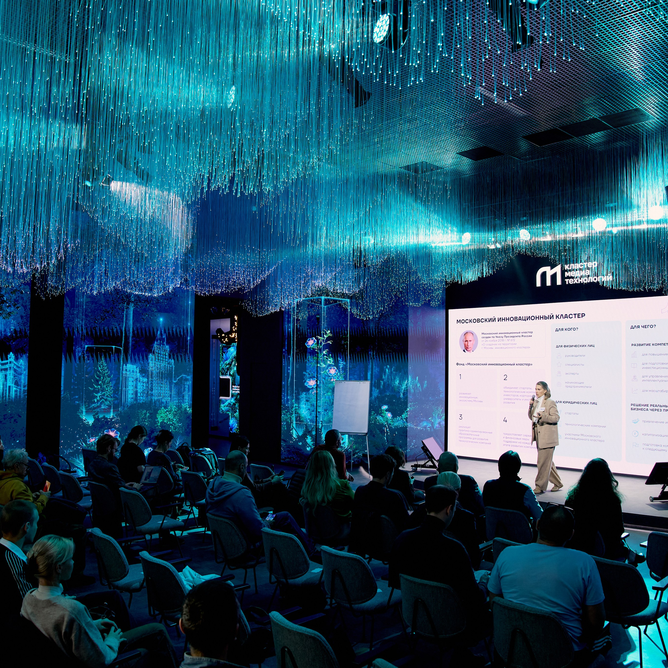
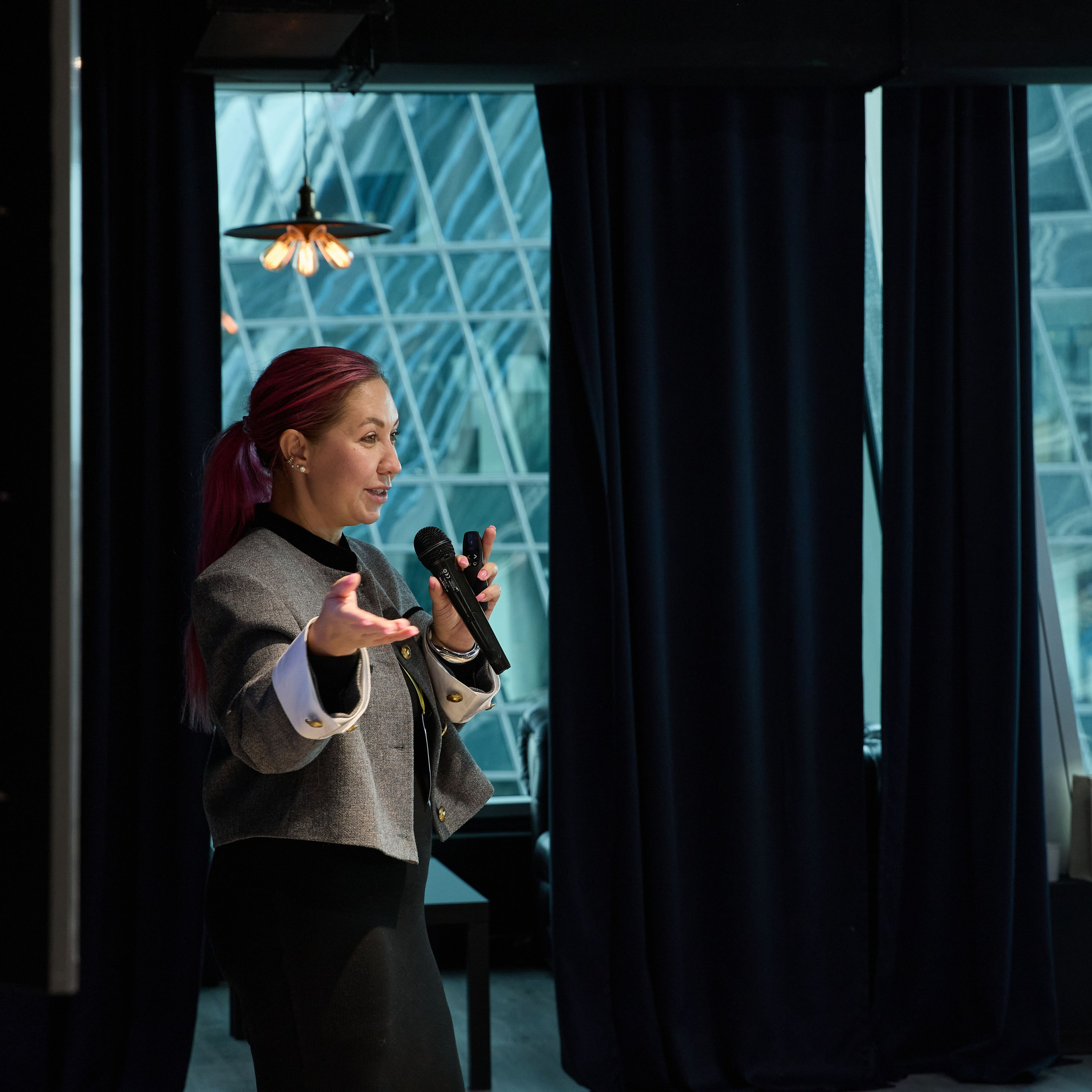
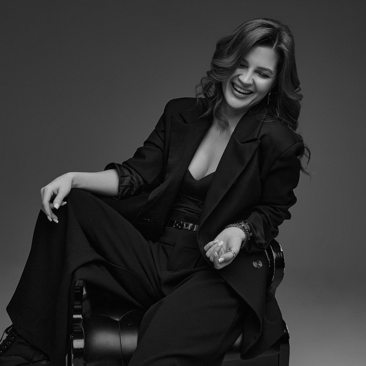
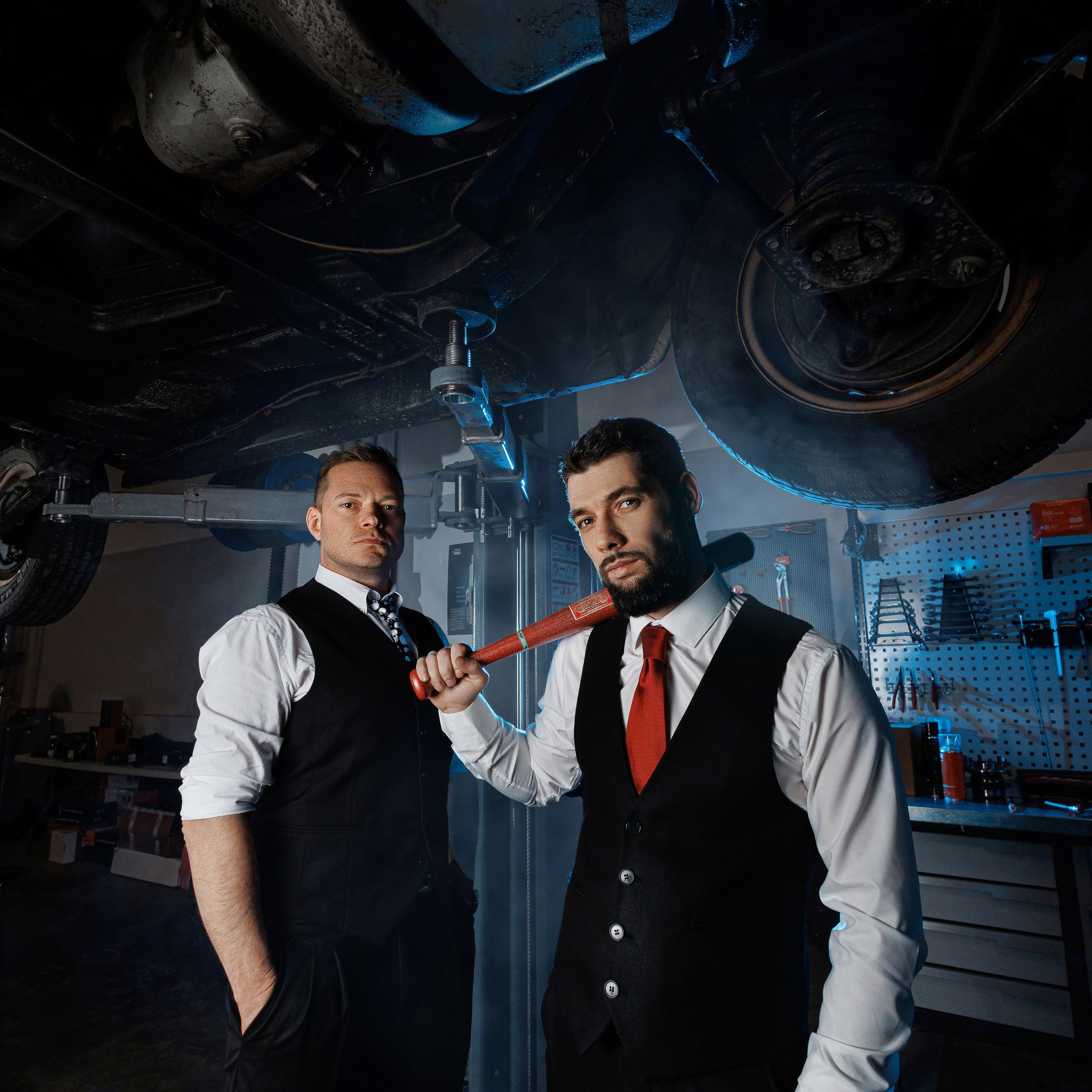
People usually choose a location with their eyes: they see a handsome loft and book it. A month later the photographs are on the website, and next to a line about the firm’s twenty years of reputation there’s a man in a jumper against a concrete wall. The frames are good. They just tell a different story.
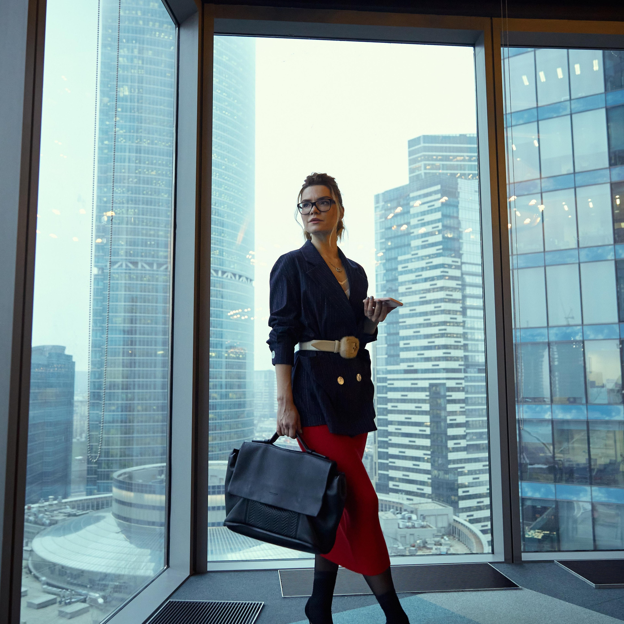
A location isn’t a backdrop. It’s the first thing a viewer reads, before they’ve read a single word. Brick and concrete say one thing, oak panelling and bookshelves another, glass and open-plan offices a third. When the background argues with the copy, the background wins: images are processed faster than text.
Below is a method for choosing a location from the brand outwards, not from the interior inwards. Three questions first, then matching your brand type, then the places the photos will run, then checking a venue before you book.
Three questions that come before you open a studio catalogue
1. Who is your client, and how should they feel?
Not “who are we selling to” but “what should this person think in the first two seconds”. “I could trust this person with money” is one location. “This person is easy to talk to” is a completely different one. “This person knows the subject” is a third.
2. What does the brand promise?
Write down three words that should stay with the viewer. Status, reliability, speed, modernity, warmth, expertise, boldness. Then test the location against each one.
3. Where will the photographs run?
The same person on a website hero, in a LinkedIn avatar and in a tender presentation needs three different frames. An avatar is a square with a neutral background. A hero is a horizontal with space for a headline. A presentation needs a restrained, formal context. Choose the location for the most demanding format, not the most convenient one.
If the answers don’t fit on one line each, you’re not ready to book a venue. Brand first, address second.
Matching your brand type
| What the brand conveys | What the frame needs | Location | What to avoid |
|---|---|---|---|
| Status and premium | restraint, expensive materials, breathing space | a studio with a dark or deep background, business-district architecture | busy interiors, stray objects, bright props |
| Expertise and experience | the environment where the work happens | office, meeting room, library, conference | an empty cyclorama with no context |
| Technology and modernity | clean lines, glass, concrete, light | open-plan office with panoramic windows, loft | heavy classical interiors, drapes, carpets |
| Reliability and conservatism | stability, symmetry, calm | a classical office, a studio with a neutral background | industrial venues, neon, graffiti |
| Warmth and approachability | something lived-in, unrehearsed | your own office, a workshop, the street outside | a spotless studio |
| Boldness and creativity | surprise, character | loft, street, unconventional textures | the office default |
One caveat before the table. Brand type doesn’t always match business type. A law firm can be conservative, or it can build its brand on speed and technology — in which case oak panelling is a mistake. Look at the positioning, not the industry.
Two axes that make the choice
Every location sits somewhere on two scales. Work out where your brand sits and half the options eliminate themselves.
The status–warmth axis. Top end: I’m expensive, my clients are serious. Bottom end: I’m approachable, I’m easy to work with. A studio cyclorama and a business district are the top. Your own office and the street outside it are the bottom. In between sit the client’s office and a coworking space.
The control–environment axis. Left end: I control every pixel, the frame is composed. Right end: I show reality as it is. A studio is maximum control. Reportage on a factory floor is maximum environment. An office is in the middle.
The trap is that these axes aren’t linked. “Expensive” doesn’t mean “in a studio”, and “alive” doesn’t mean “on the street”. A premium brand can shoot in a real office if the office is up to standard. A down-to-earth brand can shoot in a studio if the studio looks plain.

Location by where the photos will run
Photographs aren’t made “in general” — they’re made for specific places. That determines not just the background but the orientation of the frame.
| Where it will run | Frame format | Background and composition |
|---|---|---|
| Website hero, home screen | horizontal, plenty of space | restrained background, room for a headline left or right |
| Avatar in LinkedIn, Telegram, social media | square, tight crop | neutral background, contrast with clothing |
| Team page | vertical, consistent light across everyone | one background for the whole series |
| Tender presentation, proposal | horizontal, formal context | office, meeting room, library |
| Advertising and paid social | wide frame with room for an offer | a recognisable city backdrop or a branded wall |
| Conference speaker page | vertical or square, formal portrait | plain background, no distractions |
The practical conclusion: if you have five places to publish, you don’t need five locations — you need one location and three lighting setups. Changing the light within one spot gives you more varied frames than moving between spots.
How to check a venue before booking
Five questions that rule out the wrong place in ten minutes of messages.
Does the background pull focus? Look at the venue’s reference photos and squint. If the wall is the first thing you see after the blur, the wall is louder than you are.
Are there other people’s logos in frame? This matters more than it seems. A sign, a branded wall, a recognisable chain interior — and you’ve got a photograph you can’t put into advertising without clearance. Check in advance.
Does the palette clash with your brand colours? An orange wall in the frame and a blue logo on the site is a visual conflict everyone notices and nobody can articulate. Either the background follows the palette, the palette follows the background, or you go neutral.
Will the interior date? Trendy finishes read as “shot in 2024”. A neutral background lasts longer — and you’ll be coming back to these frames for two or three years.
Is there room for people and lights? Three by three metres is the minimum to place a person and two light sources. Check the floor plan, not the venue’s photos: wide-angle interiors hide real dimensions.
| Check | How to check | Red flag |
|---|---|---|
| The background doesn’t pull focus | squint at the venue’s reference photos | after the blur you see the wall, not the person |
| No third-party logos in frame | look through every interior photo | a sign, a branded wall, a recognisable chain interior |
| Palette matches the brand | compare the interior colours with your logo | an active background colour fighting the brand colour |
| The interior will last | judge how tied the finish is to fashion | trend-led materials and bright accents |
| Enough room | ask for the floor plan, not for photos | less than three by three metres of clear space |


Three mistakes I see most often
Choosing a location for beauty rather than meaning. The most common case. A handsome venue isn’t a suitable one: it can be beautiful in itself and have nothing to do with you.
Every employee on the same background, and the brand turns into a wall of honour. If a company has ten people all shot against the same grey background with the same light, that doesn’t say unity — it says absence of personality. A consistent style is needed, but across two or three setups, not one.
A location that doesn’t match the price segment. Shooting in an expensive interior for a cheap service sets a false expectation of the bill. And the reverse: a modest background devalues a premium product before the client has even heard the price.
FAQ
Can one location cover every task?
Yes, if it’s neutral. One spot and three lighting setups will cover the website, social media and presentations. The trouble starts when a neutral location is passed off as premium or as a “real office” — then it works as neither.
Do I have to shoot in an office if I run an office-based business?
No. An office gives you trust and context, but if yours is an open plan with ten people in frame, a portrait there is difficult. It’s often better to shoot one or two key people in a meeting room and the rest in a studio.
What if my brand colours clash with every location?
Shoot on a neutral background and add the colour in the graphics. Or choose a venue by palette — which is a good filter in itself: many studios list their interior colours in the description.
How do I know a location is “too much”?
If, looking at the frames, you think “what a beautiful interior” rather than “what a convincing person”, it’s too much. A good background is only noticed when it gets in the way.
How many locations should I budget for?
One, if the budget is limited. A second location isn’t “variety” — it’s an hour and a half in the car and a tired person by the afternoon. More on light and venue logistics in where to shoot business photography in Moscow.
The bottom line
The order is simple: three words about the brand first, then where the photos will run, then the address. Not the other way round.
A location works when it isn’t noticed separately from the person. If it argues with the copy, the price segment or the brand colours, it doesn’t strengthen the brand — it dilutes it, and no amount of retouching fixes that.
If you’d rather not work through this on your own, tell me what should stay with a client after they see your photographs, and I’ll suggest two or three locations for that job, with the light already tested.